A GROWING BANK STAYS TRUE TO THEIR ROOTS
From common questions to custom quotes. Give us a call or send us an email and a FIRSTBranch expert will be in touch.
Let us assess your website and identify opportunities. Fill out the form below to tell us about your institution.

Texas Bank has grown steadily over the years, opening several branches across East Texas. A merger in 2016 brought locations in the Dallas-Fort Worth area.
But success came with growing pains. A wider geographic footprint meant serving more diverse demographics. Large construction projects led to more commercial customers, requiring a shift in strategy for specific branches.
Their website needed to reflect the new aspects of the thriving bank while staying true to their East Texas roots.
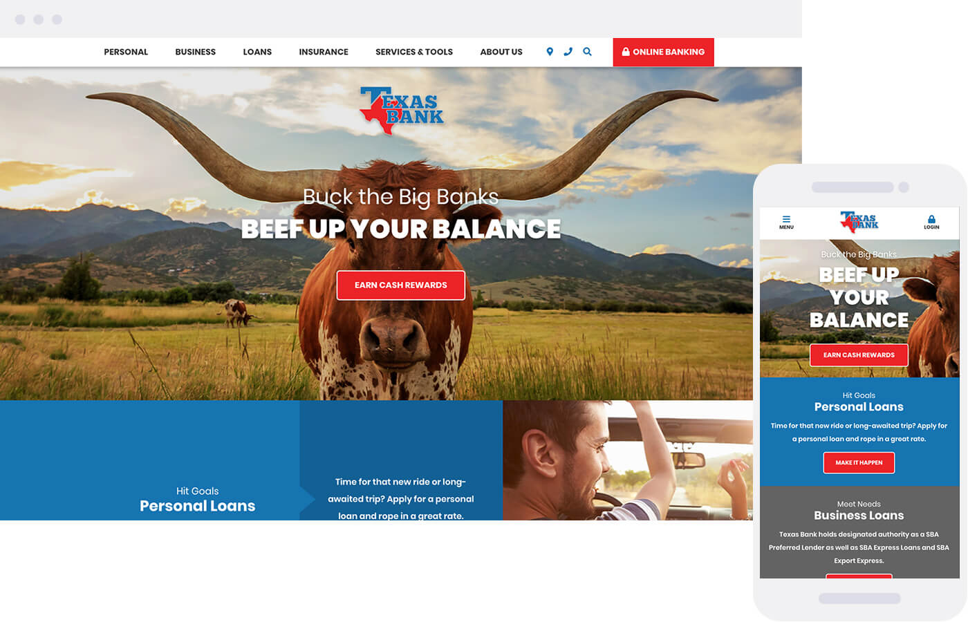
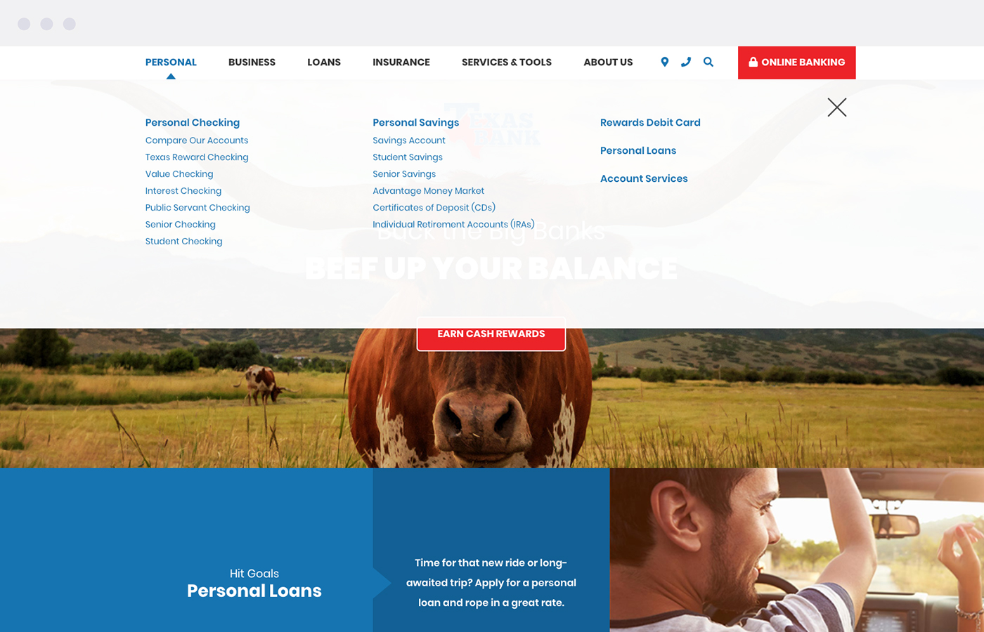
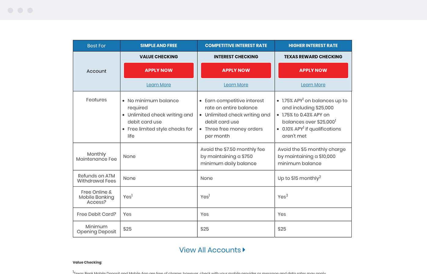
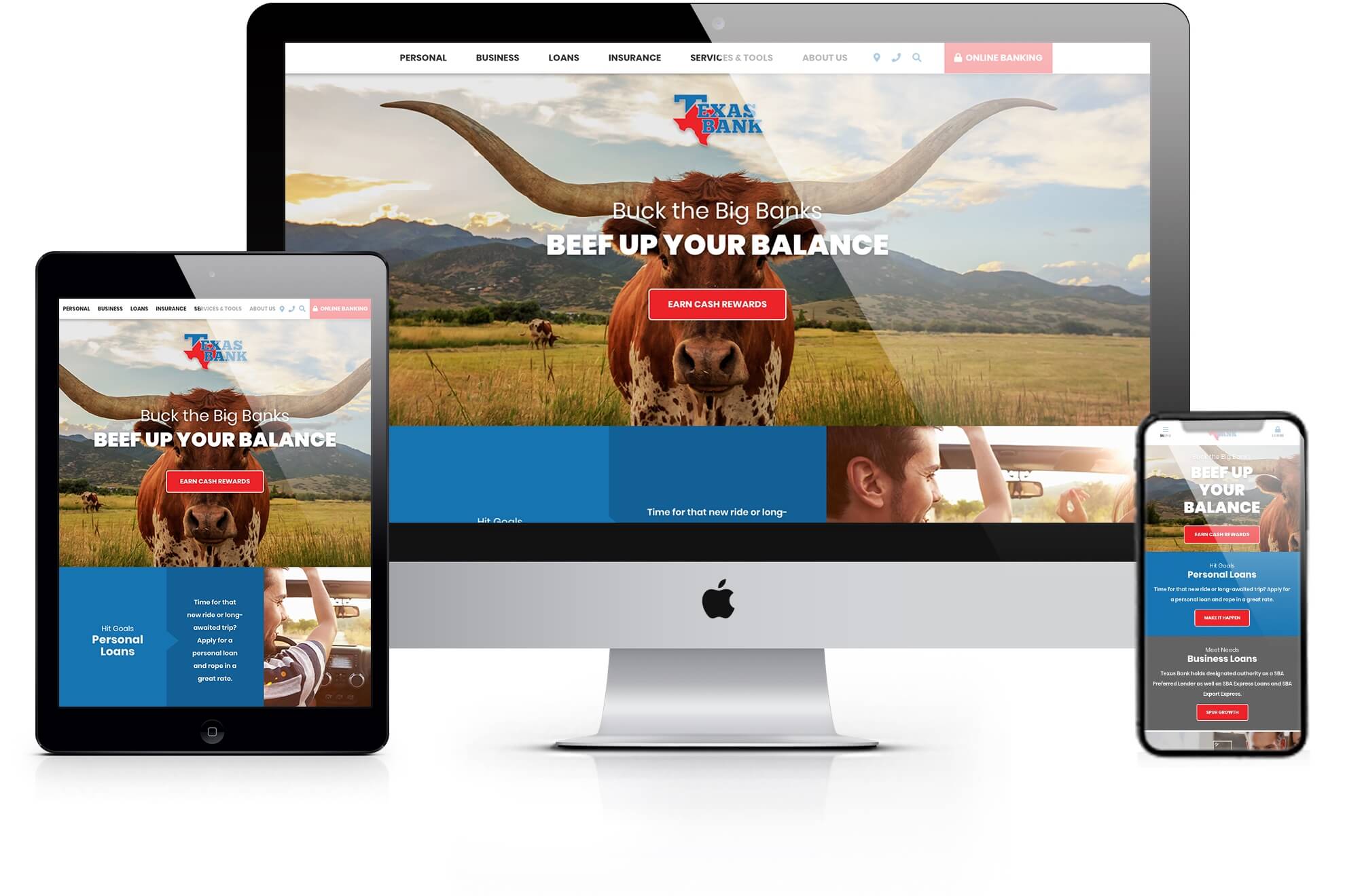
Expanding the homepage lets us showcase the many ways Texas Bank helps families and businesses. The new layout gives equal weight to deposits, loans, and services. Grouping similar products together makes content easy to review — allowing for a simpler scroll.
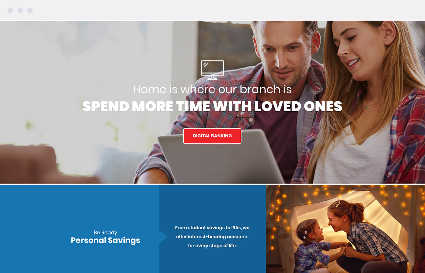
We updated the design to feel a little less country but totally Texan. Edge-to-edge images feature the Lone Star State’s scenery — from grazing longhorns to wild blue bonnets. We traded natural textures and vintage fonts for blocks of color and clean icons. Straightforward messaging welcomes visitors with a familiar voice.
