A New Bank For Austin's Entrepreneurs

From common questions to custom quotes. Give us a call or send us an email and a FIRSTBranch expert will be in touch.
Let us assess your website and identify opportunities. Fill out the form below to tell us about your institution.

When you think of Austin, what comes to mind? Tech startups. Trendy food trucks. Music venues of all sizes. All true. But the Texas Hill Country is also home to successful specialists and entrepreneurs. Lawyers, doctors, and land developers who prefer Teslas to electric scooters.
These are the customers Keystone Bank wanted to welcome when they opened their doors — even if it meant competing with Bank of America and Capital One. Rather than ask these busy professionals to visit a branch, Keystone Bank decided to engage customers with their website.
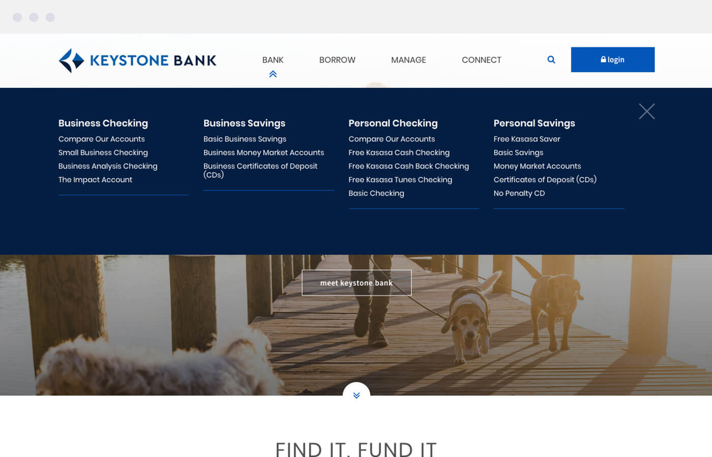
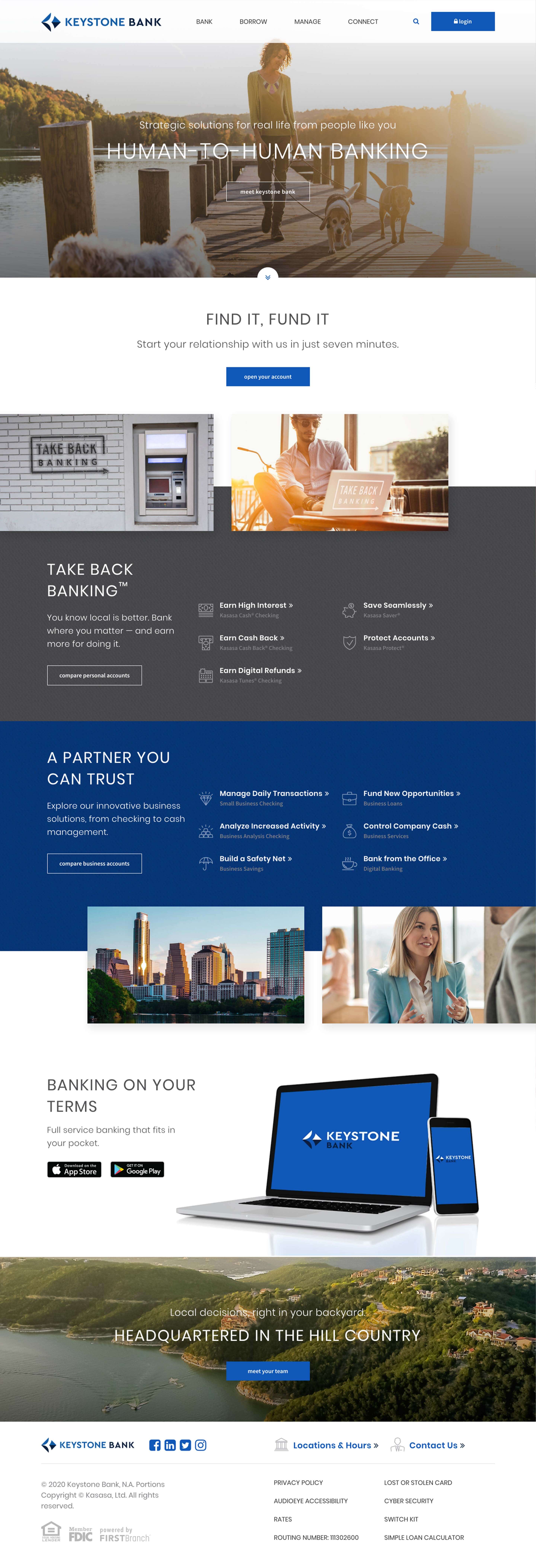
We structured the navigation to help people get work done ASAP. Action-oriented titles point users in the right direction. The mega menu offers a comprehensive list of offerings — while the footer provides fast access to useful resources.
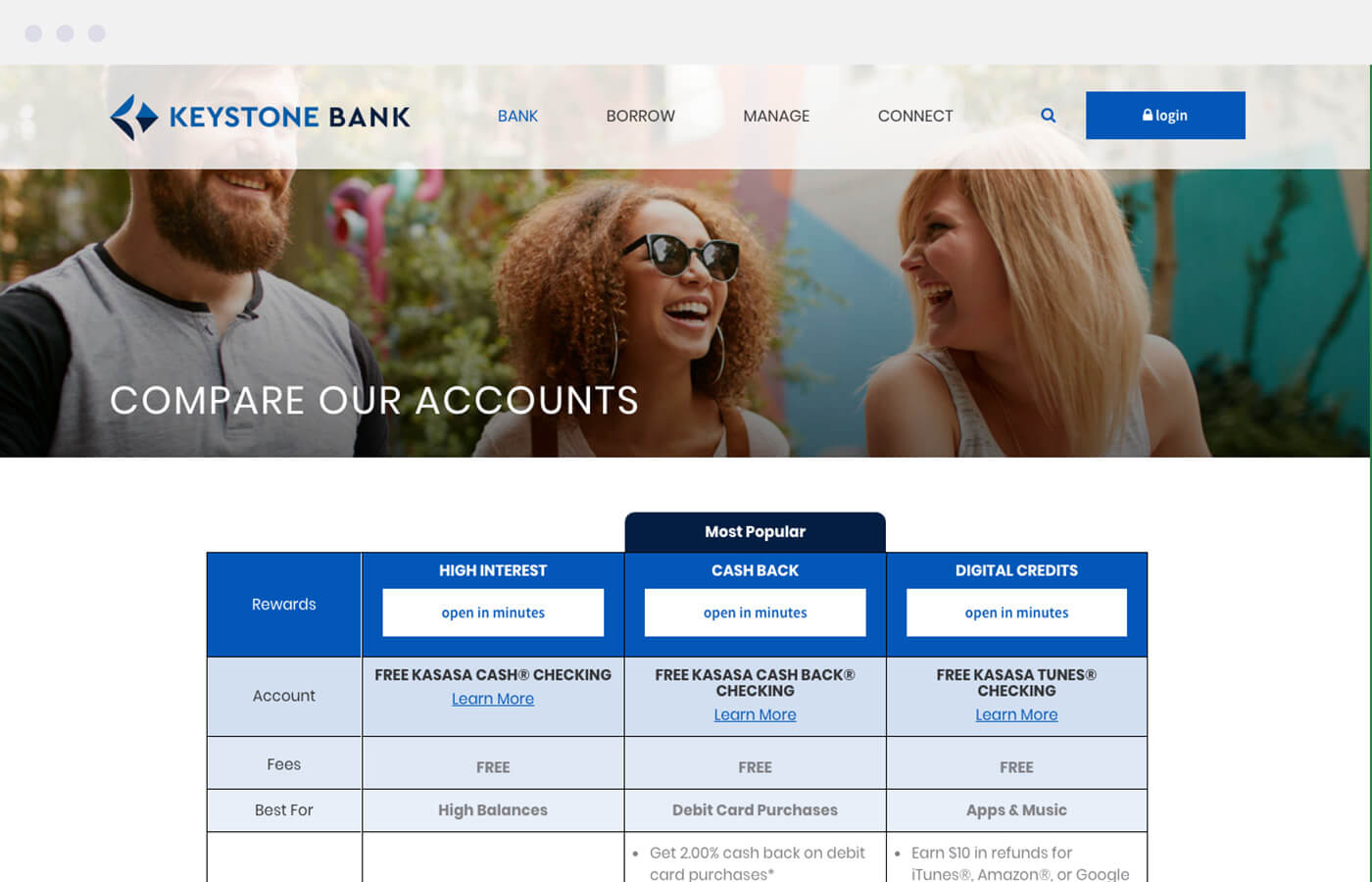
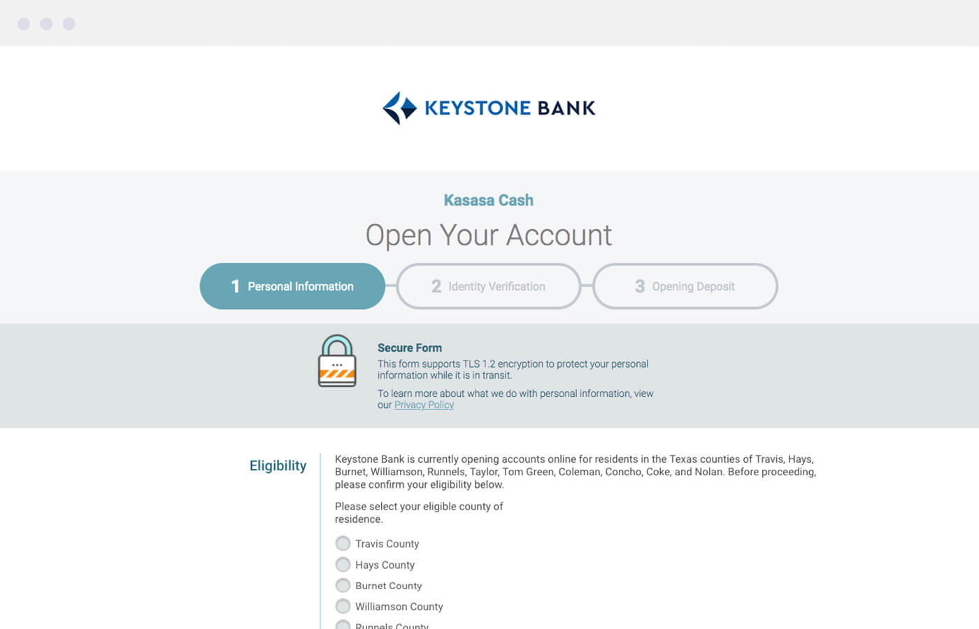
Beyond effortless exploration, we made it easy to make informed decisions. Comparison charts paired with our online account opening platform turn more browsers into customers.
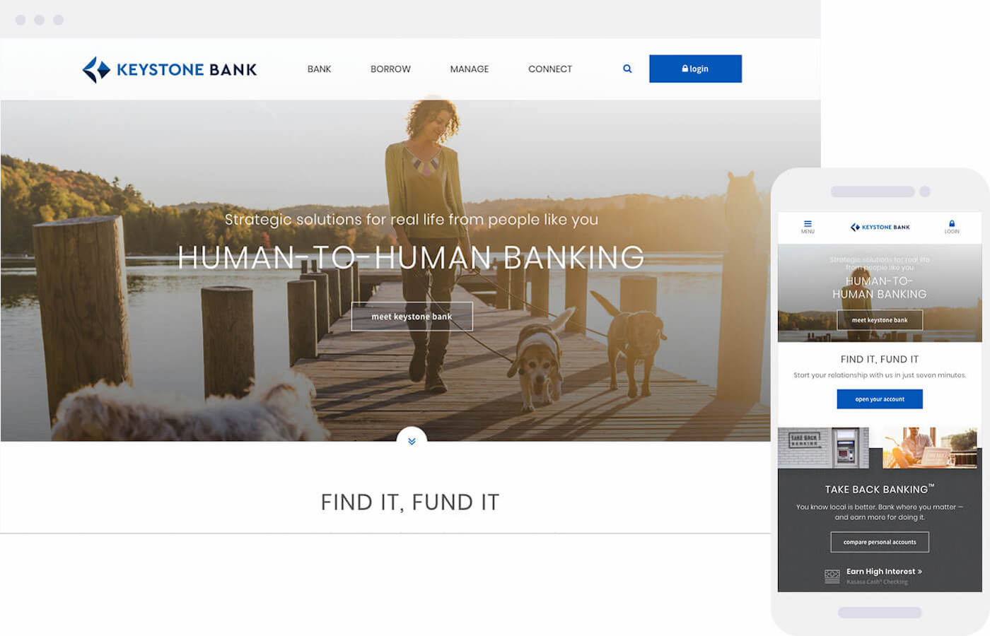
Keystone Bank’s FIRSTBranch would be the main touchpoint for Austinites. In addition to providing a welcoming user experience, we had to introduce the new bank’s brand.
Sleek, sophisticated design evokes the quality consumers expect from premium tech companies. Concise messaging conveys the benefits of banking local — emphasizing the importance of relationships for retail and commercial customers alike.
